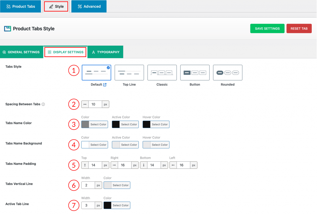
1) Tabs Style: Choose the visual design (Default, Top Line, Classic, Button, or Rounded) for the navigation tabs.
2) Spacing Between Tabs: Controls the horizontal space between the individual tab titles in pixels (px).
3) Tabs Name Color: Set the text color of the tab titles for Normal, Active (selected), and Hover (mouse-over) states.
4) Tabs Name Background: Set the background color of the tab titles for Normal, Active, and Hover states.
5) Tabs Name Padding: Adjusts the inner spacing (padding) around the tab title text for the Top, Right, Bottom, and Left sides.
6) Tabs Vertical Line: Controls the Width and Color of the vertical line that separates the tab titles.
7) Active Tab Line: Controls the Width and Color of the horizontal line that highlights the currently selected (active) tab.
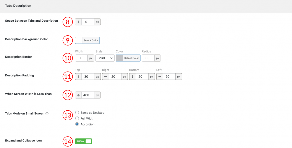
8) Space Between Tabs and Description: Controls the vertical distance in pixels (px) between the tab navigation area and the description content.
9) Description Background Color: Allows you to select the background color for the content area underneath the tabs.
10) Description Border: Defines the Width, Style (e.g., Solid), Color, and Radius of the border surrounding the description content area.
11) Description Padding: Adjusts the inner spacing (padding) within the description content area for the Top, Right, Bottom, and Left sides.
12) When Screen Width is Less Than: Set a breakpoint in pixels (px) to define when the mobile-specific display mode should activate.
13) Tabs Mode on Small Screen: This setting allows you to control how the tabs layout transforms when the screen width drops below the size defined in the When Screen Width is Less Than setting (Feature 12, typically a mobile breakpoint like 480px).
You have three options to ensure a better mobile user experience:
- Same as Desktop: The tabs maintain the original horizontal or vertical layout designed for larger screens.
- Full Width: The tabs resize to take up the entire width of the small screen, helping navigation links remain large and easy to tap.
- Accordion: The entire tab structure converts into a vertically stacked accordion. The tab titles become clickable headers that expand and collapse the content beneath them, saving vertical space.
14) Expand and Collapse Icon: This toggle shows or hides the icon used to expand and collapse the content when the mobile display mode is set to Accordion.
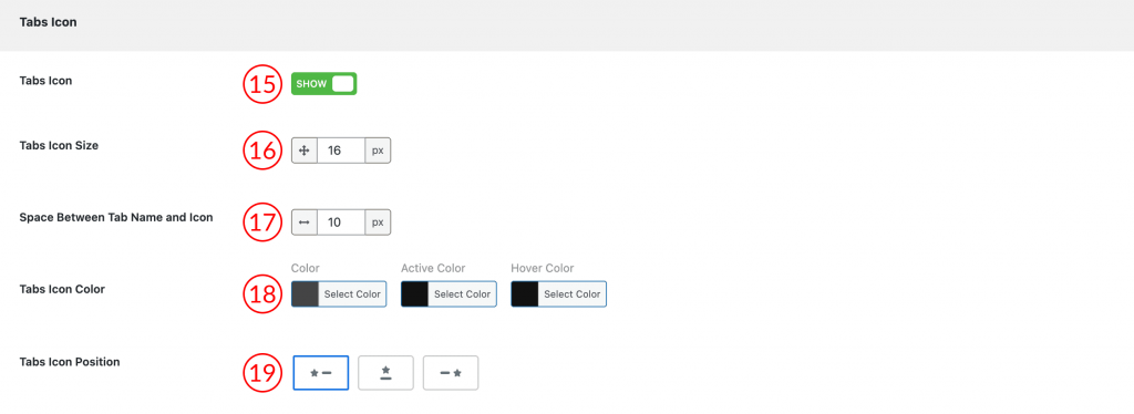
15) Tabs Icon (Show/Hide): This toggle turns the display of tab icons on or off.
16) Tabs Icon Size: Set the size of the icons in pixels (px).
17) Space Between Tab Name and Icon: Adjusts the horizontal space between the icon and the tab title text.
18) Tabs Icon Color: Set the color of the icons for the Normal, Active (selected), and Hover (mouse-over) states.
19) Tabs Icon Position: Choose where the icon is placed relative to the tab name (Left of the name, Right of the name, etc.).